How often do you wait for any website to load on your mobile device? More often? Then the next step is followed by looking for another alternative, isn’t it?
According to Statista, in 2015, 33.4% of all website traffic worldwide was generated through mobile phones, up from 28.9% in the previous year and the number is proliferating. Mobile currently accounts for a third of all global web pages served as people, these days, prefer mobile devices to visit any website.
The faster your WordPress site loads on mobile devices, the longer users stick to it. One of the important aspects to growing your site’s viewership is in making your WordPress site mobile responsive. This simple yet powerful marketing strategy will assist in the long run adding values to the visitors giving them reasons to stay and providing them with enhanced user experience. You devote a lot of your time and efforts in WordPress development services just to have a unique and reliable site, thus, cannot let anything come in your way when it’s time to capitalize and monetize from the website.
There is a transition in the way people access the internet. People find mobile devices more convenient to use, hence, have become the new internet access point. As the number of internet users on mobile devices has surpassed the desktop users and statistics show that the consumer on mobile usage is growing at an enormous rate and that mobile marketing strategy has drastically been changed and so it the mobile app development. The mobile industry is big and growing, no seconds thought to that. Therefore, most organizations are making a beeline to go that way , hence, considering mobile app development services.
Certainly, you don’t want your users to abandon your site and look for alternatives. So better make your WordPress mobile responsive and if your site doesn’t have an inbuilt plugin, then you need to consider one.
Here is the list of the of some of the WordPress plugins for turning your site mobile responsive.
WPtouch Mobile Plugin
 WPtouch is a simple plugin for making your site mobile responsive and more interactive. With the ability of customization, it is one of the widely used WordPress plugins. With WPtouch theme, it is easy to have faster responsive sites with enhancements focusing on the response. The WPtouch theme feature makes the website fast using mobile caching. It uses extensions and plugins to help render discreet content across mobile devices along with the optimized images.
When users visit your site, then WPtouch Plugin automatically displays a mobile version of your site without affecting its functionality. Implying that you’ve two versions of your site that can be accessed by anyone all the time. It provides an intuitive user interface making it easy to use for all the users irrespective of their technical expertise.
WordPress Mobile Pack
 WordPress Mobile Pack plugin helps your site transform into a responsive and progressive mobile web application. It has numerous mobile themes to choose from. It allows webmasters to package their existing content into the mobile web application that’s compatible across different platforms. If you’re worried that transforming your site to a mobile web application would in any way affect its functionality, then this plugin is for you, specifically targeted to help people transform their content without actually creating a mobile app.
WordPress Mobile Pack will make your site look and function like a mobile app but in reality, users will be accessing it from their mobile browsers. It lets you have the privilege of having two sites with this one of a kind solution.
JetPack
 JetPack is more than just a WordPress plugin for making your site mobile responsive it is a complete package for enhancing the functionality of the site. It offers the ability to use custom CSS, adding contact forms, optimizing images and much more. For further improvement like customizing your theme, you need to be familiar with CSS and PHP coding. After setting it up, you can select from two customization options and check if the display features are same in the mobile web application. Once it is created you can choose whether users are able to view the mobile version or desktop version without any difficulty. It also has a site verification tool “photon” for accelerating your site speed with the direct integration with Google+page.
Any Mobile Theme Switcher
 If you’re planning to switch to Mobile theme making it more responsive, then Any Mobile Theme Switcher is the ideal WordPress plugin. It detects the mobile browser and displays theme as the setting done from admin. You have the privilege of choosing a different theme for each mobile browser and operating system. As it displays the theme accordingly based on the pre-set options for creating mobile optimized sites. You can use this plugin for creating a fully mobile responsive site with effectively and effortlessly.
WP Mobile Detect
With WP Mobile Detect you can have the User Admin to control which content to be accessed by users and which content is to be hid depending on the user’s mobile browser or operating system. For the site to be mobile responsive maintaining responsive throughout the site is a must. User Admins can have limited coding abilities which can prevent them from maintaining responsiveness in themes. You can hide content based on visitor device at the server level and no longer have to depend on other techniques for hiding the content on mobile devices.
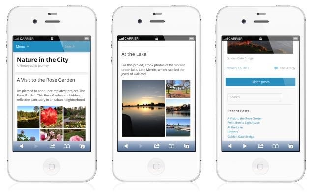
WP Mobile Edition
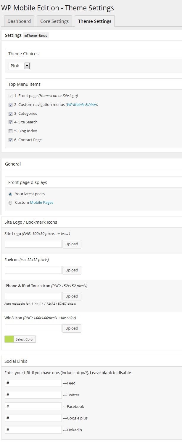 WP Mobile Edition helps you turn your WordPress site into an optimized version for a different mobile operating system. The WP Mobile Edition has a mobile switcher, which automatically detects while lets you to switch to whatever version you want ( desktop to mobile). It also comes with device adaptation, full commenting system, smart formatting, different color schemes. And what’s the add-on is that the theme is SEO-friendly making it easy for search engine crawlers for indexing your site.
Mobile Smart
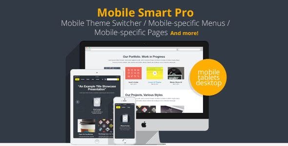 Another WordPress plugin for creating a mobile responsive application. Every time a user switches from the desktop version to the mobile version, WordPress site switch your theme which is compatible with mobile device the user is accessing the site. It works by detecting which device your visitors are using to open and thereby, displaying optimized theme accordingly. Also, it adds templates tags to differentiate which feature is unique.
This plugin not only differentiates between the desktop devices and mobile devices but detect which tier of mobile device the visitors are using i.e if they are browsing through the smartphone, tablets etc.
Let’s wrap it up:
I’ve listed some of the WordPress plugins for making your existing mobile responsive as the world is going mobile and adapting to this change is the only way out to thrive in the market competencies.
All the above-mentioned plugins are simple and easy to use. You’re just a few minutes way in providing users with a friendly user experience. You can choose any one of them depending on your business objectives and requirement. However, keep your fingers on the pulse of the technological advancement and new updates as it will give you advantages of using better and enhanced features.
About The Author:
Jessica Alba is an ed-tech enthusiast and has been associated with CWS Technology as a writer for more than 5 Years. CWS is the best WordPress development company that also provides mobile app development service and other IT solutions. Jessica has a passion for writing on emerging technologies like application management outsourcing, consulting, system integration etc.